
We all know that online sales are continually growing in New Zealand, but do you know how much of that is done from a mobile phone? It might surprise you to know that 79% of the traffic on Shopify stores comes from mobile devices.
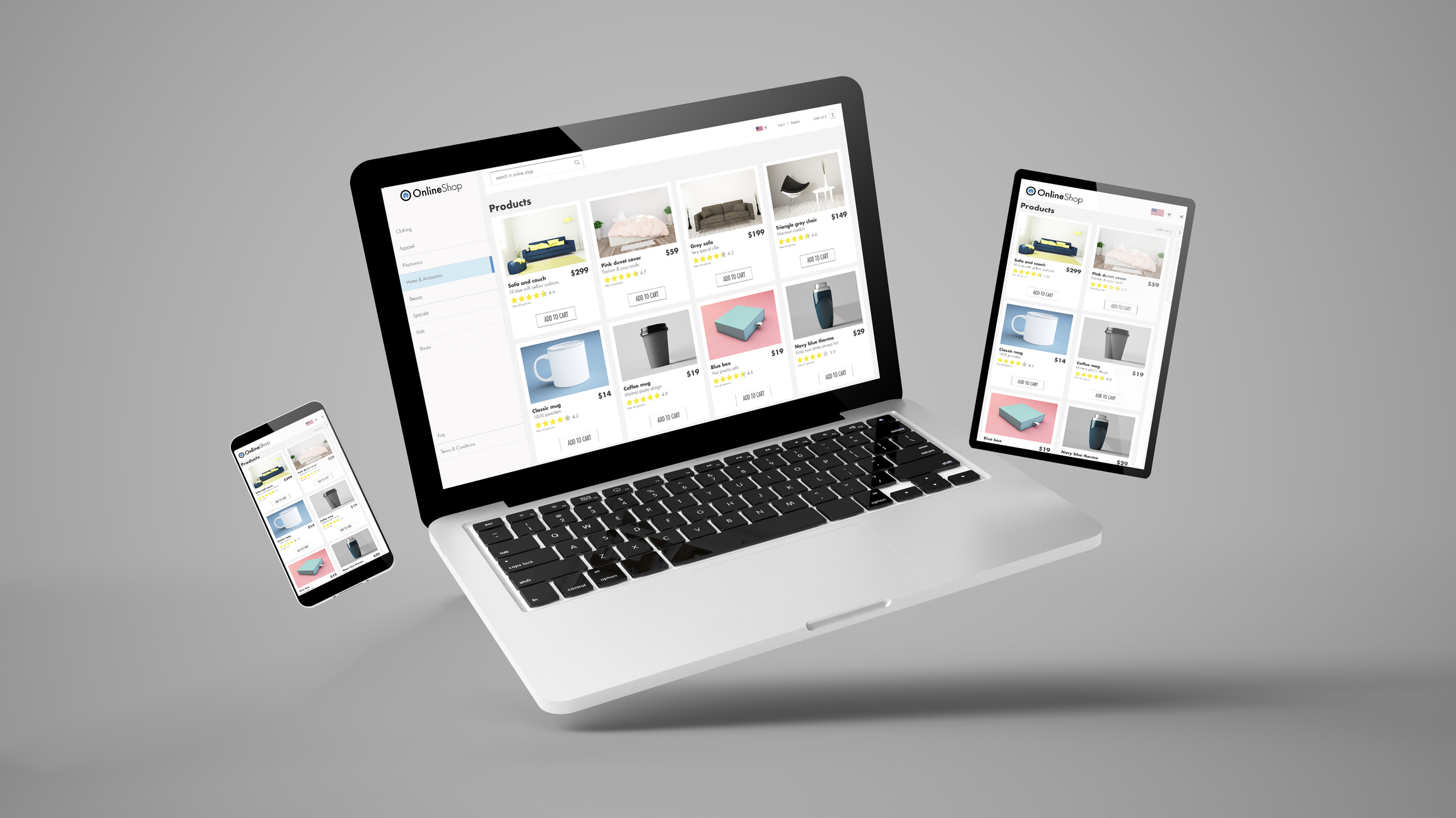
Simply put, if your Shopify store isn’t optimised for mobile, you’re missing out on sales. Mobile commerce is on the rise, and having a smooth, user-friendly mobile experience is critical to the success of your online business.
Understand the mobile user
Mobile users are usually multitasking, which means they expect a quick, hassle-free experience. If they can’t find what they’re looking for in a few taps or clicks, they’re likely to abandon your site.
This brings us to the key differences between desktop and mobile users. On a mobile device, customers expect:
- Simple, fast navigation
- Clear product images and details
- A streamlined checkout process
Mobile users are impatient and expect instant gratification. They won’t stick around for a site that takes too long to load or is difficult to use on a smaller screen. This is why optimising for mobile is so essential.
Now that you understand mobile user expectations, let’s dive into the essential elements you’ll need to focus on to make sure your Shopify store is mobile-ready.
5 key elements of mobile optimisation
1. Responsive design
Your Shopify store needs to be responsive. This means the design should automatically adjust to different screen sizes, ensuring that your content looks great and functions well on mobile devices, tablets, and desktops alike. A responsive design provides a consistent, polished experience for your customers, no matter what device they’re using.
Pro tip: Research the themes available in the Shopify theme store and make sure to read the reviews. Look for themes that load fast and are mobile-friendly. You will also want to test the responsiveness yourself on multiple devices.
2. Fast loading speeds
Speed matters, especially on mobile. If your site takes more than a few seconds to load, customers are likely to leave before they even see your products. Compress images, reduce unnecessary scripts, and make sure your Shopify store is lightning-fast on mobile.
Pro tip: Implement lazy loading so that only content above the fold initially loads. As a user scrolls down, the remaining elements will come into view.
3. Simplified navigation
Navigating a website on a mobile device is more challenging than on a desktop. Make sure your navigation is clean, simple, and easy to use with your thumbs. A sticky header, collapsible menus, and well-organised categories can go a long way in keeping mobile users engaged.
Pro tip: Many Shopify themes allow you to have different menus for the desktop and mobile versions of your website. Consider consolidating the menu for your mobile version to streamline your shoppers’ experience.
4. Product optimisation
Mobile users need to be able to see clear, high-quality product images that load quickly. Ensure your product pages are optimised with minimal text, large images, and easy access to details like pricing, sizing, and availability. The goal is to make it easy for customers to browse and buy with minimal effort.
Pro tip: Make sure your CTA buttons are larger for mobile with strong verbs like ‘Buy Now’. In addition, consider using bullet lists where possible rather than large blocks of text.

5. Streamlined checkout process
Abandoned carts can be an issue on mobile devices. The checkout process should be as quick and simple as possible. Implement a one-page checkout, allow guest checkouts, and offer mobile payment options like Shop Pay, Apple Pay or Google Pay to speed up the process.
Pro tip: Make any forms on mobile as easy as possible to fill out. Keep them short and utilise drop-down menus or radio buttons where possible.
Mobile optimisation keeps you ahead of your competitors
The competition in e-commerce is fierce, and when you ensure your Shopify store uses the elements above, you enhance your customers’ experience. This reduces bounce rates, keeps your customers engaged, and leads to higher conversion rates.
In order to maintain your mobile-friendly status, it’s important to regularly test your shop across various devices to ensure consistent performance. You can also test your Shopify site speed using
Shopify’s Online Store Speed Report or Google PageSpeed Insights.
How Webbros can help
Mobile optimisation is no longer optional—it’s a must for any e-commerce business. At Webbros, we specialise in building Shopify websites that are fully optimised for mobile. We know how to create a mobile shopping experience that keeps customers engaged and ready to convert. From responsive design to speed enhancements, our team has the skills to make sure your Shopify store is a mobile powerhouse.
Get in touch with us today for a free consultation, and let’s get your Shopify store working as hard as you do.
Related posts

Is Your Website Costing you Customers? 5 Signs it’s Time to Refresh the Design
Is your website driving away customers? A website refresh from Webbros can boost sales and engagement.
August 1, 2024

Why You Should Use WordPress to Build Your Business Website
Struggling to build a website? WordPress is the user-friendly, affordable solution you’ve been looking for. Create a professional website for your business today.
June 6, 2024

Why a Website is Your Most Powerful Marketing Tool
In today’s digital world, your website is your most powerful marketing tool. It’s the central hub for all your marketing, turning website visitors into paying customers. Are you prepared to harness this power?
April 16, 2024